Unit 5: Data Representation & Graphing
When drawing graphs, it is important to remember to label your axis, include a title for your graph, and a legend (or key) if necessary.
You also have to decide what variables to display on each axis, as well as a scale for them. The independent variable goes on the horizontal axis, and the dependent variable goes on the vertical axis. Don't forget to label each axis!
It is important to choose an appropriate scale and units for each axis of your graph. The scale and the starting point on the axes affect the way a graph is interpreted. By increasing or decreasing the scale, or by changing the starting point on an axis, you can make the viewer see the data a certain way.
Types of Data:
There are 2 different types of data: Discrete and Continuous. Discrete data is data that is only counted in wholes - like people. Continuous data is data that can be counted in inclusive parts, like weight. Can you think of other examples of each?
Types of graphs:
|
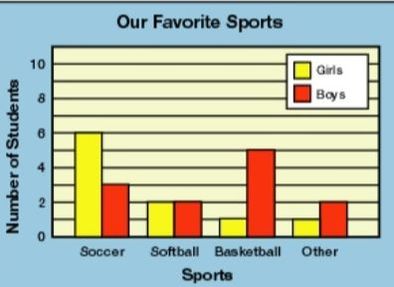
Bar Graphs: Good for comparing discrete or categorical data that has been counted.
|
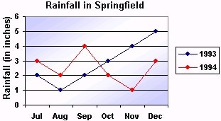
Line Graphs: Show how one or more variables change over a period of time.
|
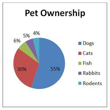
Circle or Pie Graphs: Pie charts are best to use when you are trying to compare parts of a whole. They do not show changes over time
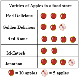
Pictographs: A Pictograph is a way of showing data using images. Each image stands for a certain number of things. You need to include a legend to indicate how much each image represents.
|
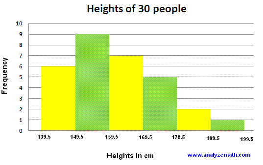
Histograms: This is used for representing continuous data that can be counted.
Infographics: They are visual representations of information, data or knowledge intended to present information quickly and clearly. The visual presentations help the reader recognize patterns and trends quickly.
|
Misrepresentation of Data:
Good graphs are extremely powerful tools for displaying large quantities of complex data; they help turn the realms of information available today into
knowledge. But, unfortunately, some graphs deceive or mislead. This may happen because the designer chooses to give readers the impression of better
performance or results than is actually the situation. In other cases, the person who prepares the graph may want to be accurate and honest, but may
mislead the reader by a poor choice of a graph form or poor graph construction (Finan, 2017).
The following things are important to consider when looking at a graph:
1. Title
2. Labels on both axes of a line or bar chart and on all sections of a pie chart
3. Source of the data
4. Key to a pictograph
5. Uniform size of a symbol in a pictograph
6. Scale: Does it start with zero? If not, is there a break shown?
7. Scale: Are the numbers equally spaced? Is it appropriate for the data?
9. Appropriate sampling
The beauty of Data Representation - a TED talk.
|
Things to consider:
|
|
Our Survey: |
| ||
Survey Assignment Part ONE:
As a class, we will be creating a survey for the entire WSS student population to take. You will contribute 2 questions to this survey. You will need to figure out how to structure your question, and the format of the responses. One of your questions should generate discrete data (ask a question that will determine the number of people, or things). The other question should yield continuous data (ask a question that will determine ranges of time, or money).
I will collect all of the questions, type them up, and distribute the survey to the school. Once we have received the completed surveys back, you will tally & collate your data. Then, we move on to Part Two.
Part TWO:
1) Decide which types of graph will best represent each of your questions.
2) Create your graph in Excel. Be sure to include all elements of a proper graph. (Hint- see above!). Be sure to save this file.
3) Start a Word Document and title it "Graphing and Data Representation- WSS Survey".
4) Type out your question and response options. Include your data (number of respondents to each question)
4) Using the SnipIt tool, select your graph in Excel, save it as a jpeg, and post it as a picture under your question.
5) In a few sentences below your graph & data:
- Explain your results
- Explain why you've selected this type of graph
- Comment on your reaction to this data (are you surprised? Is it representative of the school/community?)
- Do you think you asked your survey question correctly, or could you have improved the wording? (was there confusion in the responses?)
- Identify possible sources of error in this data (think of all stages of this process: survey question/distribution/analysis/graphing/interpretation)
- Determine the Mean, Median & Mode for each question. Which measure of central tendency is most appropriate for your data?
Part THREE:
1) Consider our discussion about misrepresenting data. Think about how you could misrepresent your data.
2). Either using Excel, or by hand, I would like you to *misrepresent* your data for ONE of your questions, using one or more of the sneaky tricks above.
Finally, Print off your word document, and submit this assignment to Mrs. Colpitts before by Dec 20th.
1) Consider our discussion about misrepresenting data. Think about how you could misrepresent your data.
2). Either using Excel, or by hand, I would like you to *misrepresent* your data for ONE of your questions, using one or more of the sneaky tricks above.
- If you use Excel, snip and paste it on you eP under Part 1, with the heading "Misrepresenting Data".
- If you create your new graph by hand, do it as neat and professionally as possible, take a photo of it, and upload that photo to your eP.
Finally, Print off your word document, and submit this assignment to Mrs. Colpitts before by Dec 20th.
